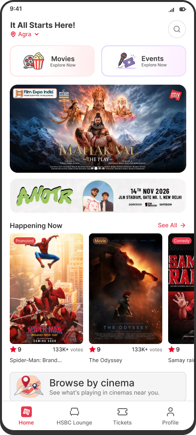
BookMyShow is an app people in India use to book movie tickets. It also sells tickets to comedy shows, concerts and sports, which I’ll call Events. Most people never see them. I redesigned how the app helps people discover Events.
Role
Product designer
Goal
More people booking Events
Tools
Figma, Cursor
Help movie browsers discover other things to do
Most BookMyShow users open the app, go to Movies, and scroll through films first. When nothing feels interesting enough to watch, the app has other things to offer: comedy shows, concerts and sports. But those options are easy to miss.
I started by improving this drop-off point, then worked back to the homepage.
Users leave when they can’t find a movie worth booking
Most people who open BookMyShow with no plan in mind browse Movies, find nothing and leave. They came to buy something, and the app sold them nothing.
The people I designed for have no plan in mind, and leave because Events are hard to discover inside the app.
Recover users after movie discovery fails
The goal wasn’t to route users away from Movies. It was to offer another bookable plan without making it feel like a detour.
Where should Events appear without interrupting movie browsing?
I compared three places on the movie page.
1
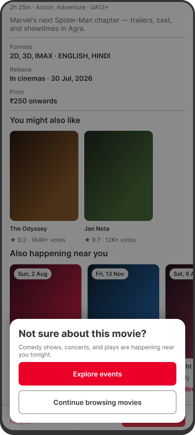
A pop-up when the user is about to leave.
Catches the exit moment
Interrupts people
Feels promotional
Adds friction at the worst moment
2
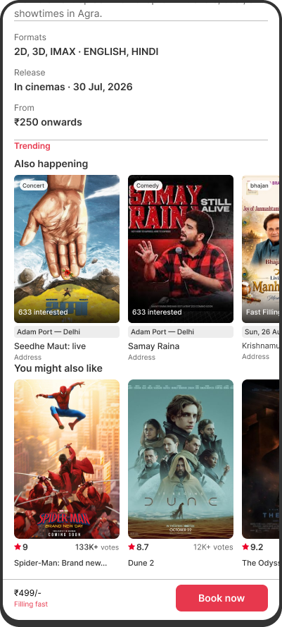
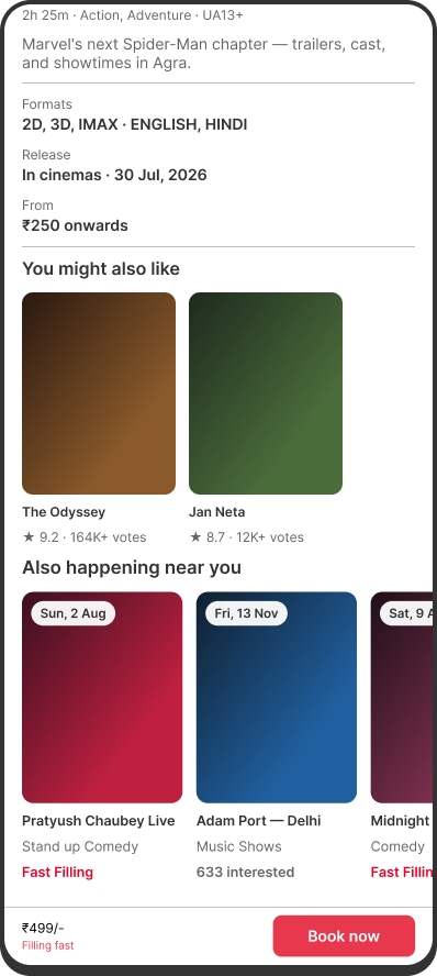
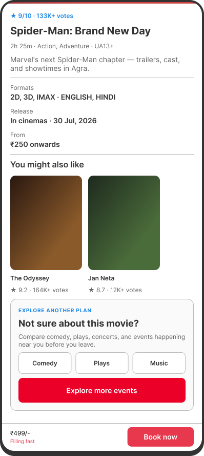
A row of nearby events inside the movie page.
Keeps users in context
Doesn’t interrupt
Shows real alternatives right away
Users have to scroll to reach it
3
A card that opens Events categories.
Very visible
Adds another decision
Sends users down a new path
Doesn’t show alternatives right away
I went ahead with Events inside the movie page. They keep users in context, so the next option feels like a continuation, not a detour.
How should users evaluate an unfamiliar event?
Tapping an event could open its full page, or a quick preview. I compared both.
Live prototype · loops
1
Tapping the card opens the full event detail page.
Fastest path for users already interested
Moves users away from the movie page immediately
Live prototype · loops
2
Tapping the card opens a compact preview, then lets users view details or book.
Keeps users on the same page
Enough information to judge if the event is relevant
Adds one step before booking
I went ahead with a preview before commit. Tapping an unfamiliar event doesn’t mean users are ready to leave the movie page.
The problem was being solved too late
The Events row recovered users after they had committed to Movies. So I decided to move upstream, to the homepage, where that choice is first made.
Users choose Movies before deciding what they want to do
Most people I interviewed went to Movies first, even when they hadn’t decided what to watch. Two kinds of people were being pushed the same way:
“I don’t know what I want tonight.”
This person wants ideas, not a specific category.
“I want to go out — maybe not a film.”
This person wants to go out, but may not want a film.
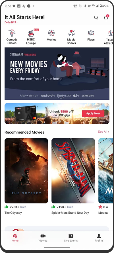
BookMyShow today
Movies come first
Events are only small chips at the top.
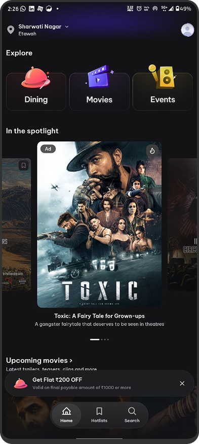
Another app, District
Equal entry points
Dining, Movies and Events all get the same weight.
The homepage was pushing users toward Movies before they had chosen what kind of plan they wanted.
Redesigning the homepage to help users choose what to explore
The audit: Movies dominated attention while Events were easy to miss
Movies dominate attention
Featured carousels, recommended films and promotional banners fill most of the feed.
Events are technically available
Comedy, plays and music appear mainly as small chips at the top. Participants often overlooked them or continued into Movies.
Discovery is fragmented
Each category opens separately, so it’s hard to compare movies, comedy, concerts and sports in one place.
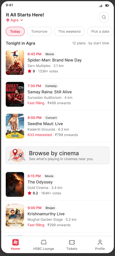
Three homepage directions I explored
Most people went to Movies first, so the homepage had to help them choose a kind of plan before a film. Banner ads and “Browse by cinema” had to stay on the homepage, so every direction had to make room for them.
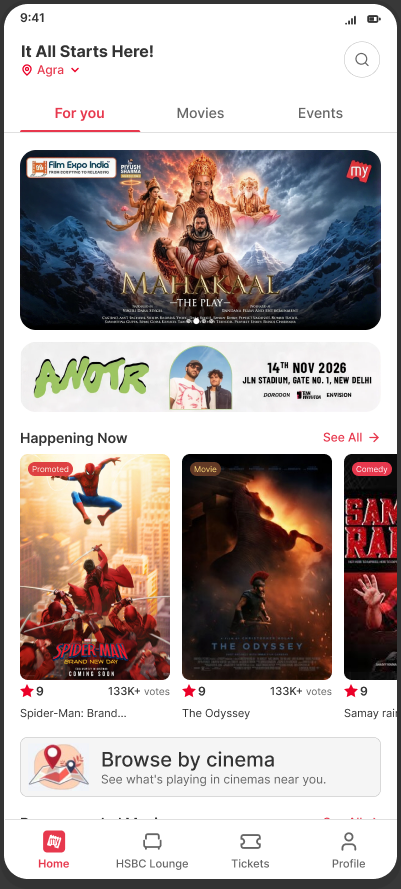
Two equal entries + mixed discovery
Movies and Events get equal doors at the top, with a mixed carousel below. Neither category is the default, and the ad stack stays intact.
Direction 1 · Chosen
Neither category is the default
The ad stack stays intact
Undecided users browse films and events together
Adds one more content layer
Tabbed home
Tabs for For you, Movies and Events put Events level with Movies. But they move the Movies-first habit one level down, and split ad impressions across three feeds.
Direction 2 · Rejected
Events sits level with Movies
Moves the Movies-first habit one level down
Splits ad impressions across three feeds
Browse by cinema only fits the Movies tab
Plan your evening
One mixed list of movies and events, sorted by start time, with date chips on top. It’s the closest to “What should I do tonight?”, but it leaves no room for banner ads.
Direction 3 · Rejected
Closest to “What should I do tonight?”
No room for banner ads
Needs a date filter to track
Users with a film in mind scroll a mixed list
Prototype testing validated the core flow, but not yet at scale
I tested the prototype with 3 participants across 3 tasks.
Passed
Finding Events directly
The selector gave them a direct path to Events home and tickets.
Needs validation
Browsing without a fixed plan
They noticed the mixed carousel first, but this needs testing with more real users.
Passed
Movies still easy to find
Movies stayed easy to find for users who came for films.
Discover Events before and after Movies
The homepage helps users choose earlier. The movie page catches them if that choice doesn’t land.
Undecided user
Mixed discovery
Knows what they want
Movies | Events
Opens a movie or event
Interesting enough
Books it
Doesn’t feel right
Also happening → Preview → Books it
Suggestions from the other category
Try the prototype
Go from the homepage to booking an event. Choose Movies or Events, open something and book it.
Events weren’t shown while users were still deciding
Most people entered Movies first, even when undecided
Recovery on the movie page was necessary, but not enough
What the prototype showed
Events and Movies were both easy to find.
Open-ended browsing needs more users
No live traffic, so no real business metrics
Whether noticing Events turns into bookings is still unproven
The goal wasn’t to make users choose Events instead of Movies. It was to make sure that browsing Movies didn’t hide every other plan BookMyShow already sells.
Happy to walk through the full process: research, rejected explorations and testing.